Liquidity Provisioning
DGB
2022

Overview
Krystal is a platform that provides user-friendly analytics and management tools for liquidity provision on DEXes. It caters to a wide range of DeFi and Crypto assets spanning over 50 chains, enabling users to offer liquidity using a single token or token pair. Additionally, Krystal offers a mobile application for convenient access to DeFi while on the move. When creating graphics, the primary focus is on the target audience and developing a concept that resonates with the brand's identity. The goal is to produce visually captivating animations that effectively communicate essential information in an interactive manner.
-
Solo Project
-
Research • Design • Illustration • Animation
-
Illustrator • Photoshop • Procreate • Final Cut
Conceptualization

This design intricately weaves together all provided references to craft a visually captivating and forward-looking setting. By incorporating stroke animation through advanced coding techniques, the logo undergoes a significant transformation that heightens its visual allure. Moreover, the inclusion of subtle star animations infuses a mesmerizing quality into the overall experience, enriching the design with an added dimension.
Introducing fresh space elements, the design raises the bar for adventure and innovation, effectively embodying the essence of decentralized finance. It beckons users to delve into the boundless opportunities offered by this pioneering technology, underscoring the ongoing development of a state-of-the-art platform tailored to user requirements. With its bold aesthetics and lively ambiance, this design serves as a testament to the potency of creative ingenuity within the realm of DeFi.
How can Krystal use static & animated graphics to create DeFi ads that attract new users?
Design Principles &
Design System
Upon reviewing Krystal's website and previous ad campaigns, my aim was to thoroughly explore Web3 aesthetics while maintaining the brand's identity. Given that users typically have a short attention span of just 5 seconds, I focused on utilizing animations to instantly grab their attention. By incorporating both static and animated graphics, I showcased the variety of crypto options offered on their platform as well as the benefits of engagement. This strategic approach is designed to pique users' curiosity effectively.


Static &
Animated Graphics
Video 1: With Text
Logo intro: 0:10-0:16
Logo outro: 0:16-0:20
Background loop: 0:00-0:20
Size: 1280x720
Video 2: Without Text
Logo intro: 0:00-0:06
Logo outro: 0:06-0:10
Background loop: 0:00-0:20
Size: 1280x720
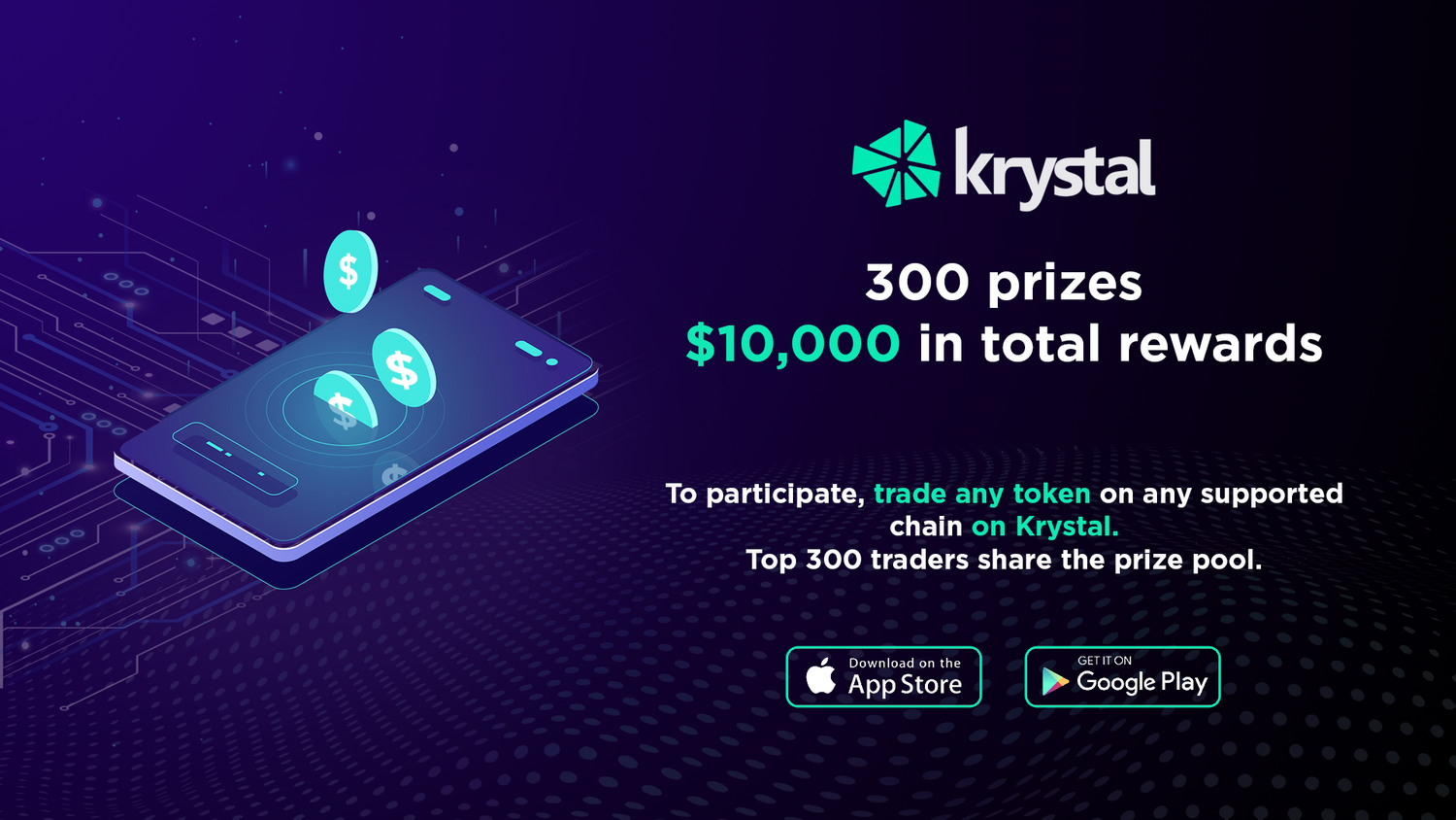
Static Graphic V1
Version 1 of the design seamlessly incorporates subtle DeFi elements while emphasizing the campaign's focus on asset trading and success. Carefully curated text colours were chosen to align with the brand's guidelines, ensuring effortless readability at initial viewing. The illustration embodies a whimsical and welcoming depiction of the campaign's intent, alluring users to delve into and engage with the platform. Clear directives on downloading the app from the App Store or Google Play Store are included, enhancing the user's onboarding process with a smooth experience.

Static Graphic V2
The primary goal of Version 2 was to enhance the overall design. This involved integrating additional Defi elements to showcase the diverse range of coins accessible for trading on the platform. In order to uphold alignment with the brand's visual identity, the selected text colours adhered closely to the brand guidelines. The design focuses on facilitating swift and clear recognition of the supported chains and enabling convenient access to the application through the App Store or Google Play Store. Careful consideration was given to the selection of mockups and Defi elements to ensure effective communication of essential information to the user.
Takeaways
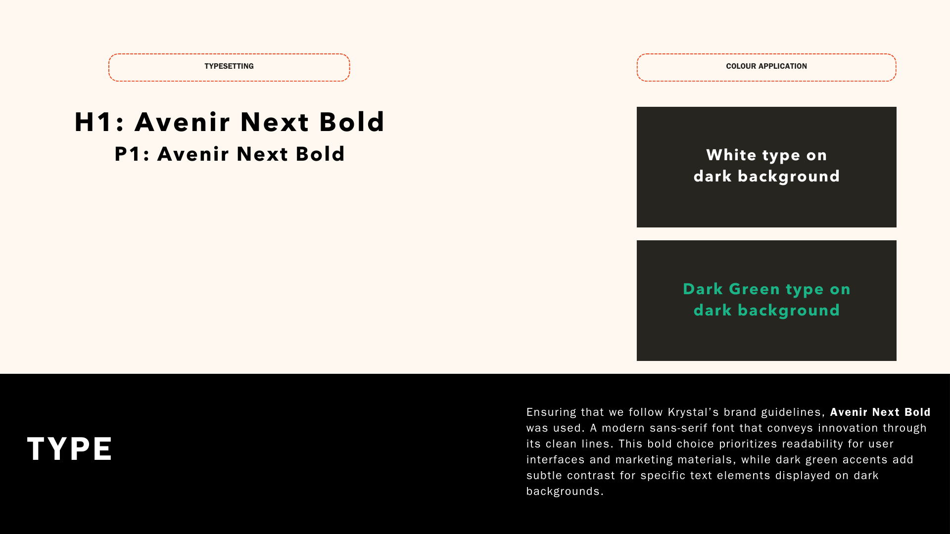
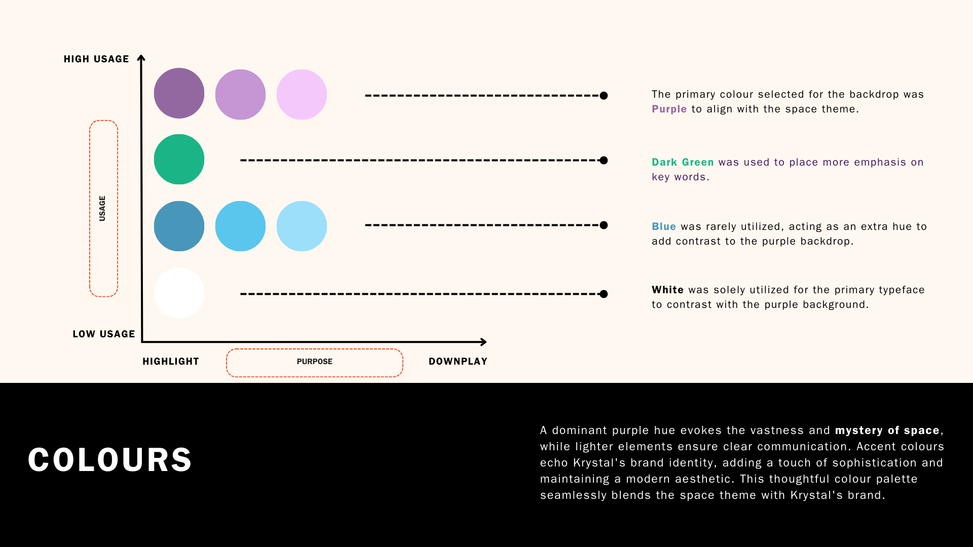
The project delved into a space-inspired theme to capture the interest of potential new users for Krystal's DeFi platform. The creative strategy integrated both static and animated graphics, keeping Krystal's branding at the forefront. It prominently showcased the Avenir Next Bold typeface, complemented by a colour palette of purple and dark green.

While the space theme offered a visually engaging aesthetic, future projects can benefit from considering the target audience's preferences more directly. There's also room for experimentation with tailoring messaging for different user experience levels within DeFi, which could be impactful for future campaigns. The project highlights the importance of strategic type selection based on the project's goals and target audience. Finally, developing a colour palette with intention goes beyond visual appeal; colours should evoke emotions or align with the project's message.
Let’s Connect
amanda.tn@gmail.com
-
![]()
SYNCWAVE
-
![]()
Krystal
-
![]()
DOOKIE
-
![]()
SOHO
-
![]()
DGB
-
![]()
SEPHORA
-
![]()
HAPPY BONES
-
![]()
SOL