Inspire and Energize New Yorkers
Happy Bones
2020
Overview
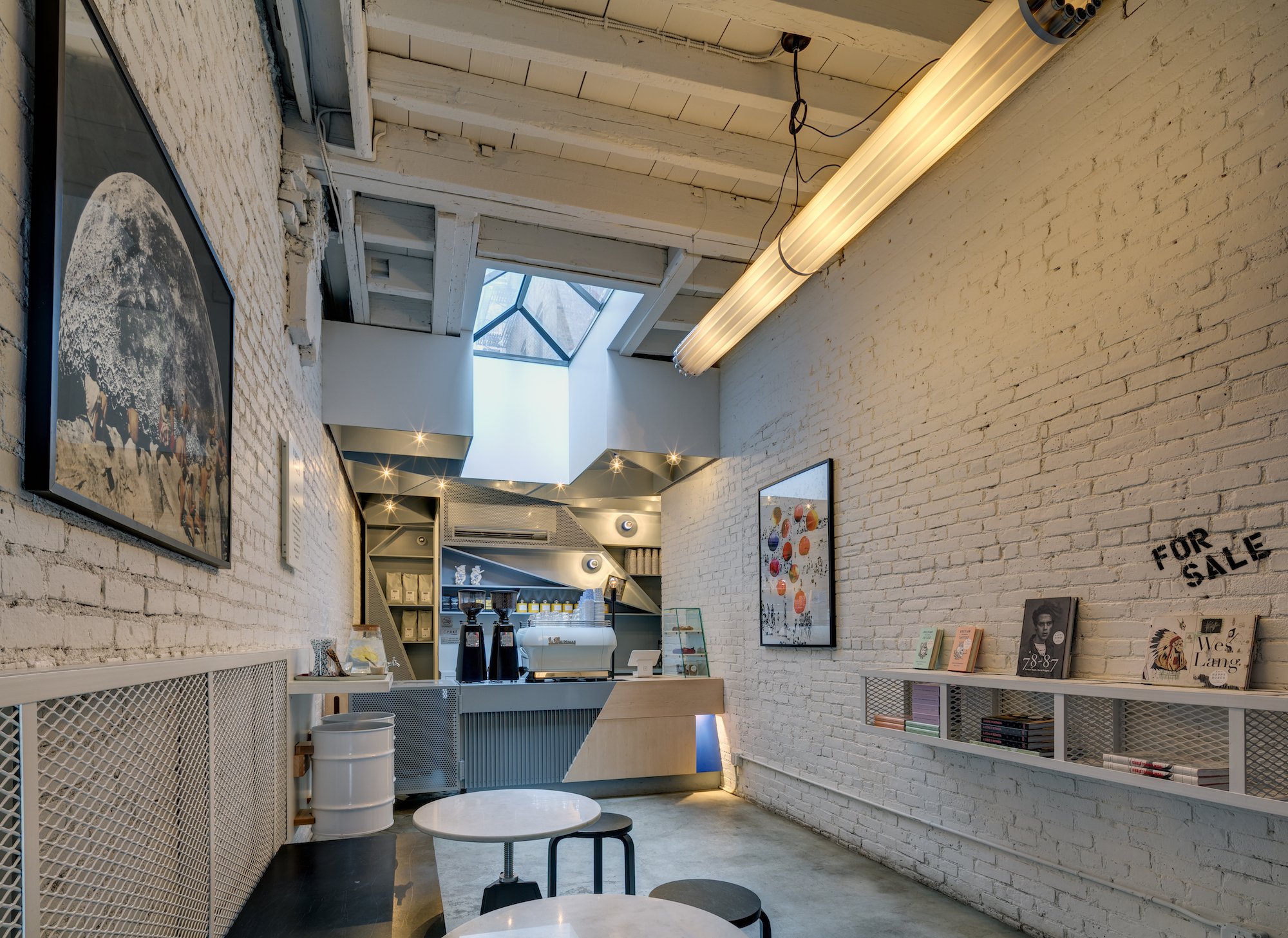
Upon visiting Happy Bones, a coffee shop located on Broome St. in Lower Manhattan, just a short walk away from the vibrant neighbourhood of SoHo, I was immediately struck by the potential for improvement in their packaging. It sparked a creative drive within me to revamp the current design, which exuded a somewhat grungy aesthetic, in order to broaden its appeal and resonate with a wider range of consumers.
-
Solo Project
-
Research • Package Design • Logo Design • Typography
-
Illustrator • Photoshop
Conceptualization
Upon analyzing the foot traffic encircling Broome Street, a predominance of sophistication was noted in the crowd, possibly emanating from the adjacent SoHo district. This observation sparked a novel perspective on packaging design. The existing design (attached) may be perceived as edgy, conveying an underground ambiance that fails to harmonize with the coffee shop’s interior. My aim was to center the redesign around a creative interpretation of the shop's name, 'Happy Bones'.
Can a minimalist design with a focus on visual storytelling effectively communicate a product's core benefit?
Design Principles &
Design System
The coffee bag design effectively utilizes text hierarchy in a modern and streamlined manner. By featuring the brand name prominently at the top of the bag in a sans-serif font, it immediately grabs the audience's attention and clearly communicates the product's identity. Supporting details such as the brand's establishment date are presented in smaller text below, ensuring a structured flow of information that guides the viewer's focus and communicates essential information efficiently.
Takeaways
The package design for Happy Bones showcases the effectiveness of minimalism and clean lines. A soft, neutral base colour sets the stage for a refined aesthetic, while allowing the bold black typography to stand out prominently. The incorporation of playful bone-structured text adds a modern and inviting touch to the overall design.
Minimalism emerges as a potent force, harmonizing a limited colour palette and sleek contours to shape a refined and elegant visual identity. By skillfully integrating contrasting components, the clarity of the design is accentuated, especially evident in the fusion of diverse background hues and text shades, thereby enhancing the effectiveness of conveying messages. Infusing a touch of subtlety and whimsical charm through artful language or intricate design elements injects a playful undertone into the sophistication of the overall design, ensuring a delicate balance between creativity and refinement.
Let’s Connect
amanda.tn@gmail.com


