
We Belong to Something Beautiful
Sephora
2020

Overview
In an effort to improve the user experience and make it easier for customers to find what they are looking for, I recently redesigned their homepage to declutter the amount of text. Gone are the long blocks of text that used to dominate the page, replaced with clean, easy-to-read headings and short, concise descriptions.
The new design also features larger, more vibrant product images and prominent calls to action, making it easier for customers to navigate to different sections of the website and find the products they want. Overall, the redesign is streamlined and the homepage takes on a modern look.
-
Solo Project
-
Research • Wireframe • Product Design • UI • Prototype • Usability Testing
-
Figma
Conceptualization
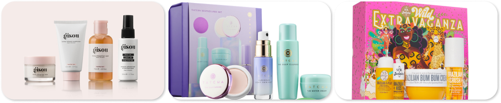
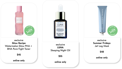
The primary focus is on eliminating the text-heavy design used by Sephora. While it's crucial for users to access product information easily, the emphasis is on highlighting the products themselves. Beauty items are meant to enhance or improve imperfections, and the design should reflect the delicate nature of what beauty products provide.
I also aimed to use an alternative typography that would enhance the delicate aesthetics of the curved frames featured in the product images, adding an extra layer of visual appeal to the overall design concept.
How can this redesign effectively guide users towards product discovery and purchase decisions through strategic use of visuals, while minimizing the reliance on extensive text descriptions
Design Principles &
Design System
During the conceptualization phase, the groundwork was established for a design aimed at effectively highlighting the product. By conducting a comprehensive review of the app's existing design, a new design was crafted to engage consumers and pique their curiosity regarding the product's offerings. The simplification of the design by eliminating unnecessary clutter from the text-heavy interface resulted in a cleaner and less overwhelming overall design, facilitating easier navigation for users interested in exploring the product further.
Through meticulous analysis and creative reimagining, the redesigned interface now serves as a captivating gateway for consumers to discover more about the product. The strategic removal of extraneous elements from the previous design enhanced the visual appeal and user experience, allowing individuals to seamlessly navigate through the product offerings that intrigue them. This meticulous approach to revamping the design during the conceptualization phase has not only refreshed the user interface but has also set the stage for a more engaging and user-friendly interaction with the product.


Takeaways
The app redesign focused on showcasing Sephora's products through a streamlined interface. A user-centric strategy was employed to engage consumers and generate interest in the product lineup. An extensive evaluation of the current app pinpointed opportunities for simplification. Through the elimination of text-heavy sections and superfluous elements, the redesign successfully delivered a more polished and intuitive user experience.

To optimize the user experience, it is crucial to prioritize high-quality product images in the app. Incorporating images of people using the product can add a human element that enhances effectiveness. By simplifying the design, eliminating unnecessary elements, and focusing on essential information, navigation can become more seamless. These user-centered approaches foster a visually engaging, decluttered, and efficient experience, ultimately maintaining user-friendliness and boosting usability significantly.
Let’s Connect
amanda.tn@gmail.com
-
![]()
SYNCWAVE
-
![]()
KRYSTAL
-
![]()
DOOKIE
-
![]()
SOHO
-
![]()
DGB
-
![]()
HAPPY BONES
-
![]()
SOL