Naturally Tinting Body Cream
SOL
2019

Overview
SOL represents a novel packaging design tailored for a tinting body cream. Its standout characteristic lies in the intriguing approach to the progressive tint that intensifies over time with regular application.
-
Solo Project
-
Research • Design • Package Design
-
Illustrator • Photoshop
Conceptualization

In developing the design, my focus gravitated towards simplicity, subtlety, and captivating aesthetics. The objective was to conceive a design that is visually alluring and peaceful, resonating deeply with the intended audience.
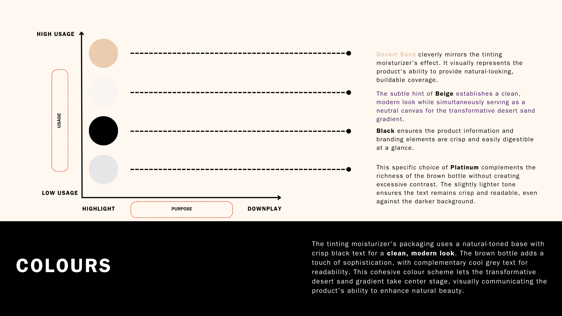
Meticulously choosing colours was integral in shaping a design that radiates refinement and elegance. The packaging design mirrors a gradual shift by seamlessly blending graceful transitions and delicate gradients. The overall aesthetic seeks to instill a feeling of calm and beauty, underlining the product's commitment to a natural progressive tint.
Can a minimalist design with a focus on visual storytelling effectively communicate a product's core benefit?
Design Principles &
Design System
During the conceptualization phase, meticulous attention was paid to every detail to craft a package design that harmoniously embodies the essence of the tinting moisturizer within. Moreover, the package design serves as a visual ambassador for the tinting moisturizer, effectively communicating its benefits and unique selling points at a glance. Every aspect was carefully curated to enhance the overall user experience. In essence, the package design not only fulfills its utilitarian purpose of protecting the product but also elevates it to a realm of desirability.


Takeaways
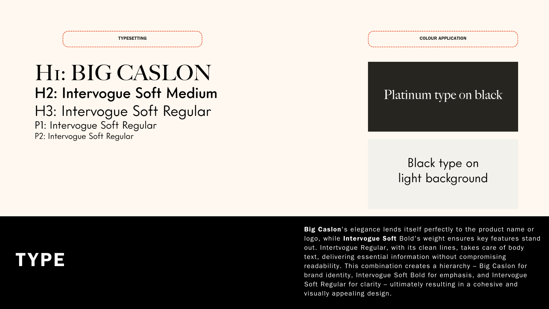
The packaging of the tinting moisturizer features a visually captivating design utilizing a gradient effect to symbolize the product's primary advantage. A sleek foundation enhances the gradient, resulting in a contemporary appearance. The clear and contrasting typography guarantees easy readability for consumers.

Utilizing gradient as a storytelling tool, a thoughtfully crafted blend of colours can efficiently convey a product's primary advantage, reducing the need for excessive text. Additionally, selecting foundational colours with precision serves as a canvas to establish a specific aesthetic while accentuating other design components. By embracing sophisticated simplicity through a neat colour palette that delineates a clear hierarchy between text and background, a design can achieve a contemporary and visually pleasing look.
Let’s Connect
amanda.tn@gmail.com
-
![]()
SYNCWAVE
-
![]()
KRYSTAL
-
![]()
DOOKIE
-
![]()
SOHO
-
![]()
DGB
-
![]()
SEPHORA
-
![]()
HAPPY BONES