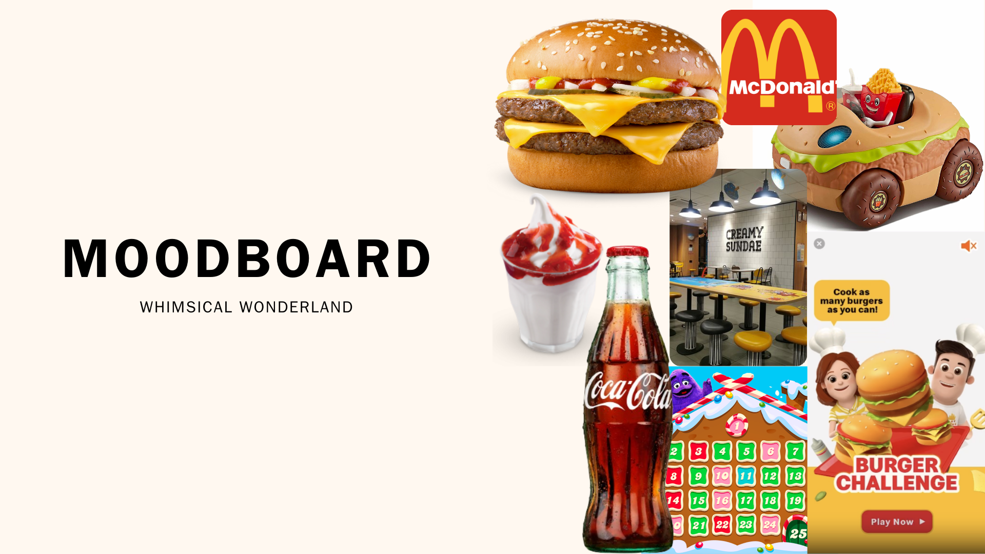
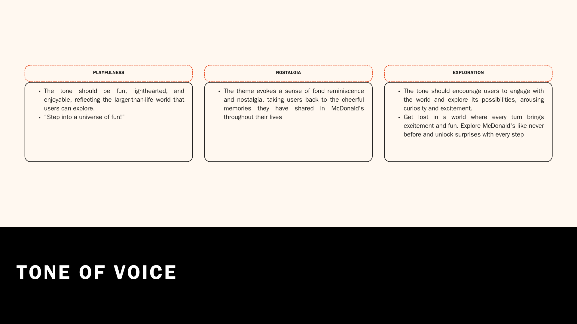
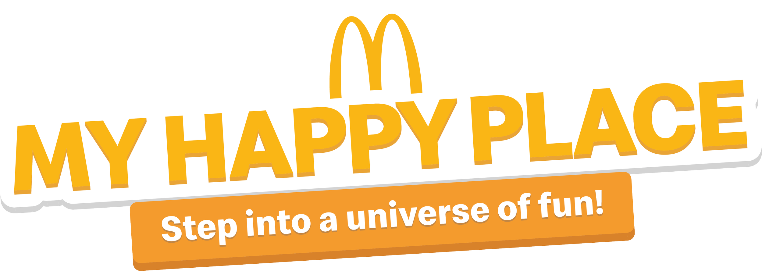
Step Into a Universe of Fun!
My Happy Place
2024
Overview
This project reimagines user engagement through gamification and immersive branding. By intergrating Coca-Cola’s iconic visuals alongside Grimace and McNugget Digital Collectibles into a playful virtual world, I crafted an experience that increased engagement with an average gaming time of 8 mins and brought 100k+ unique users. From research and usability testing to high-fidelity design, my approach ensured user satisfaction and seamless cross-functional collaboration. Discover how I tackled challenges like tight deadlines and technical limitations to deliver this innovative digital experience.
-
1 UI/UX Designer • 2 3D Designer • 2 Software Engineers • 1 3D Animator
-
Research • Sitemap • Wireframe • Product Design • UI • Prototype • Usability Testing
-
Notion • Figma • Google Forms • 1:1 interviews • Focus Groups • Mobile Research
-
![]()
-
![]()
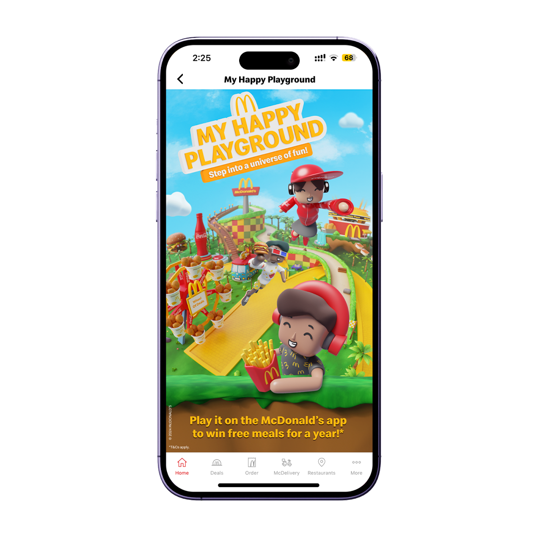
1. McDonald's Homepage
-
![]()
2. Loading Screen
-
![]()
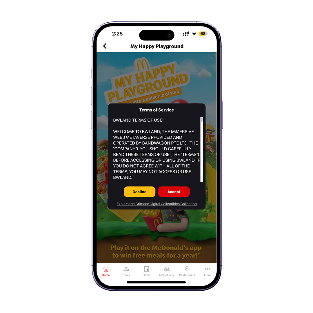
3. Read & Accept T&Cs
-
![]()
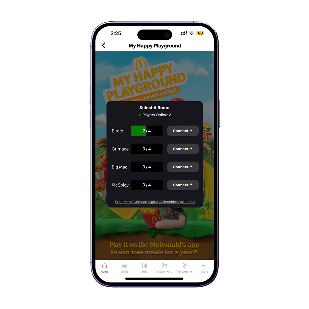
4. Select Room
-
![]()
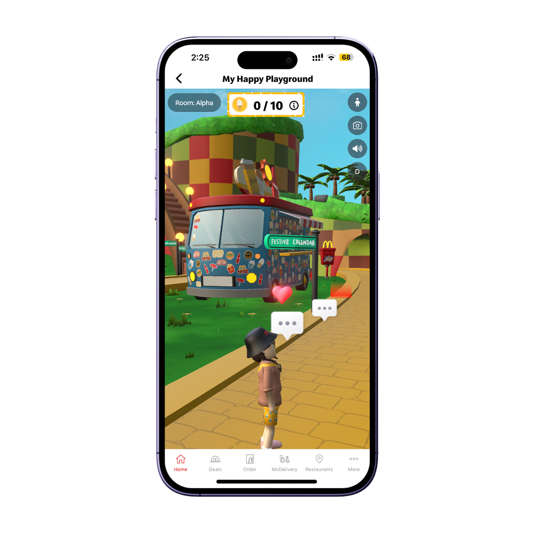
5. Explore
The Opportunity
In previous instances, McDonald’s had organized metaverse events; however, there was an absence of genuine connection and a web3 element in the activations and games. My Happy Place was conceived as a dedicated space for both McDonald’s crew members and devoted fans to forge connections based on their shared love for the brand. Leveraging the capabilities of BWLand, we sought to craft a virtual world that offered a departure from reality while still evoking a strong sense of brand familiarity. This endeavour entailed thorough research and development efforts to ensure that our vision could be realized successfully.
The Challenge
When designing My Happy Place, our team prioritized intuitive usability and user safety, given that the platform is hosted on BWLand. This required us to carefully consider which features to include and exclude; consequently, despite removing video chat, we integrated asynchronous social features like Grimace’s Corner to foster community interaction. We still ensured that users could connect with one another seamlessly and that the platform's games could effectively engage them, optimizing retention rates and time spent on the site.
Before embarking on the market research phase, I needed to bear in mind specific considerations aligned with McDonald's requirements and priorities. By gaining a comprehensive understanding of these factors upfront, it would allow me to conduct the market research in a more targeted manner and ultimately shape the overall vision and direction of the virtual world I was designing. Keeping McDonald's needs and necessities at the forefront ensured that the resulting product would align closely with their objectives and resonate effectively with their target audience.
User research
Research

Market Research
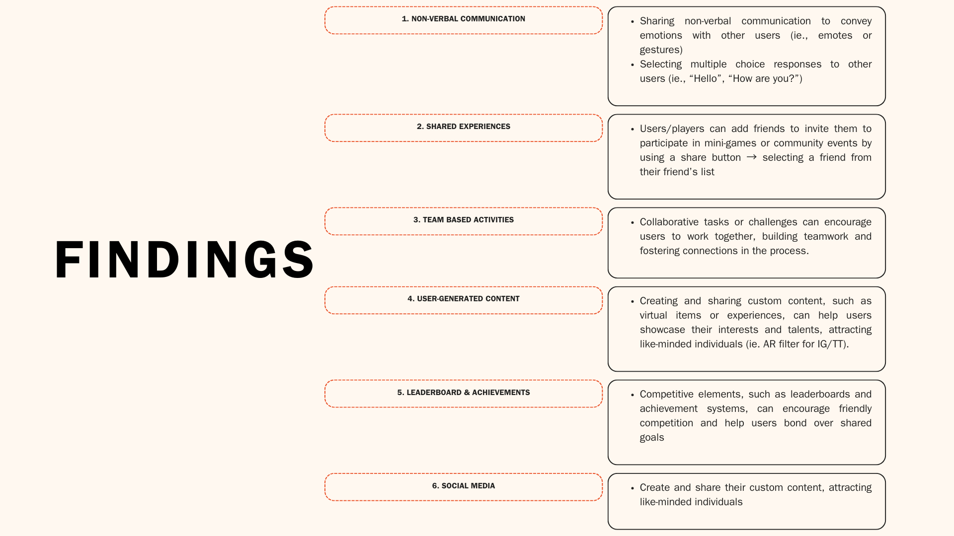
Once I comprehended the requirements, I utilized them as a foundation for my exploration of captivating games or activities that could attract user traffic and sustain consistent engagement on the platform. However, there were several internal factors that also influenced our market research. These factors included:
User records:
• Storing user scores and achievement records across for all users for a multiplayer aspect, proved to be very costly to maintain.Moderated Chatbox:
• Filtering keywords, banning users, and moderating requires manual work that may not be 100% effective.Weekly Game Releases:
• Allowing the games to be available from the launch date onwards, gives users ample time to practice and get better acquainted with the navigational controls.Multiplayer Games:
• Enabling users to engage in friendly competition and immersive gaming experiences with their circle of friends, fostering a sense of camaraderie and enjoyment proved to be unachievable within the timelines.
How did 'My Happy Place' achieve successful user engagement and align with McDonald's priorities during the month-long launch of engaging activities and games?
Features
The next phase involved conceptualizing the product’s components.
Utilizing user stories derived from the focus group results, I prioritized them using the MoSCow prioritization approach.
Phase 1: I prioritized the 'Must-Haves' and 'Should-Haves' user stories. The 'Must-Haves' concentrated on vital information needed for user engagement, while the 'Should-Haves' revolved around features that could improve the user experience.
Phase 2: This would focus on the 'Could-Haves' meant for exploration in a subsequent product development phase. It would cover extra features that piqued the interest of users during the research. These include opportunities like multiplayer gaming experiences and enhancing community engagement by providing a method for users to connect and share their experiences.

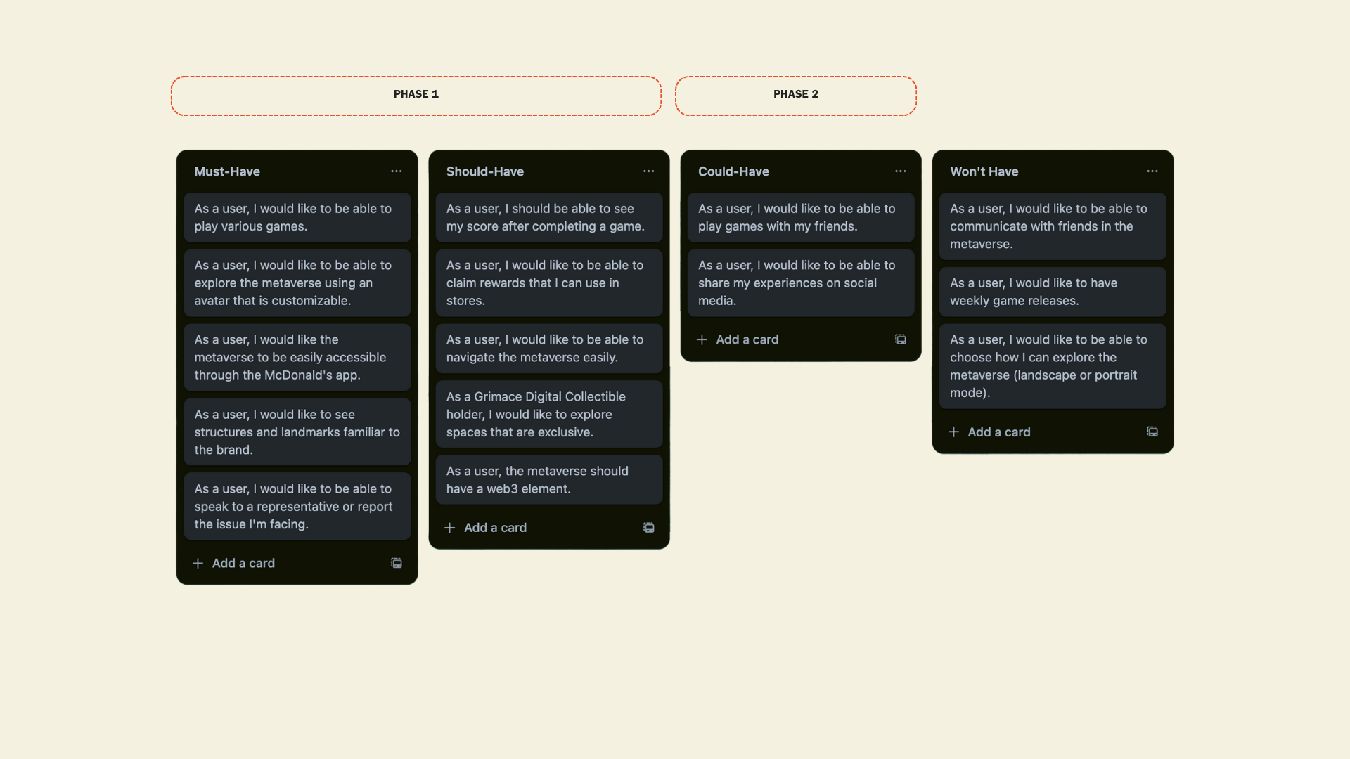
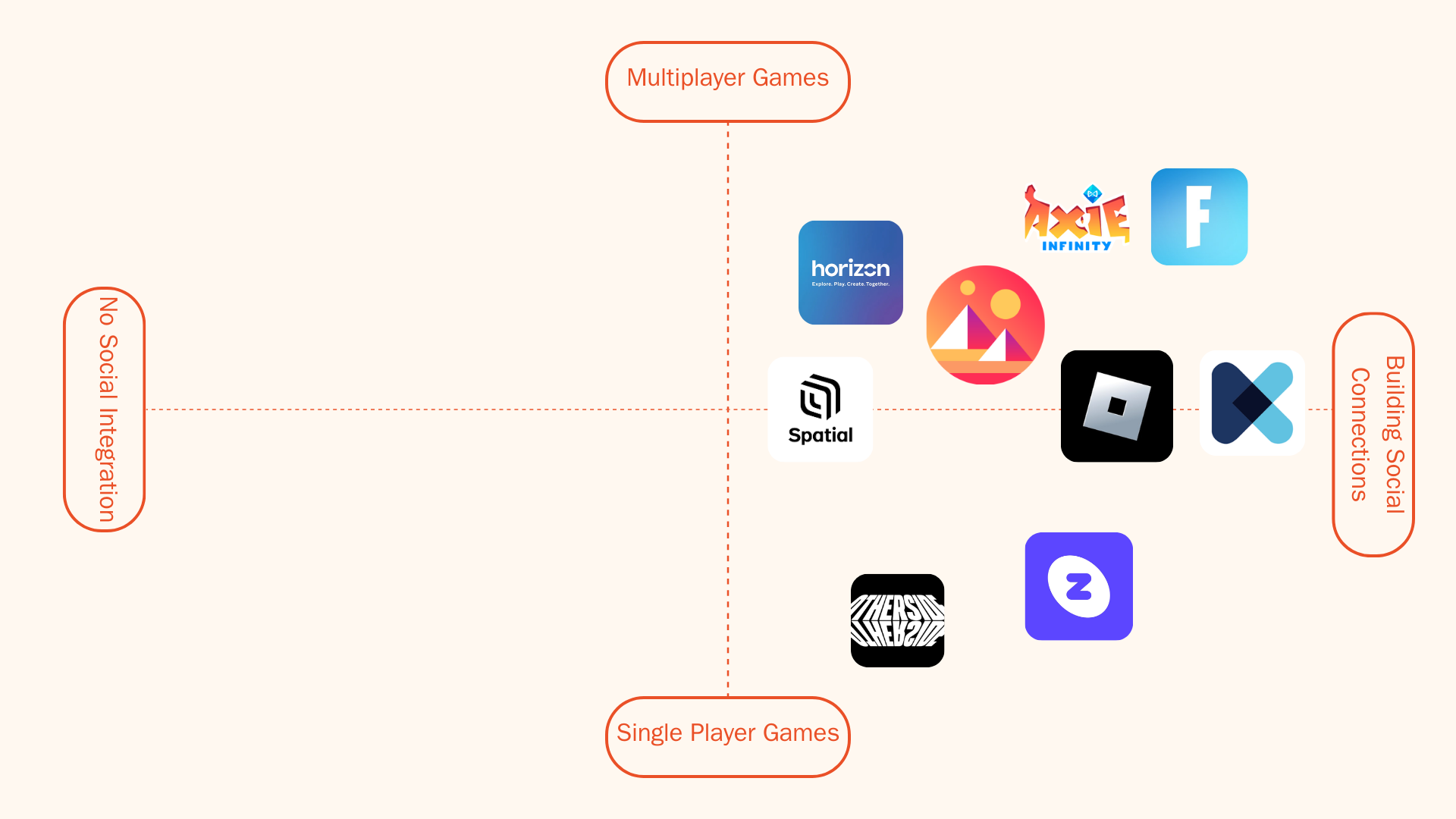
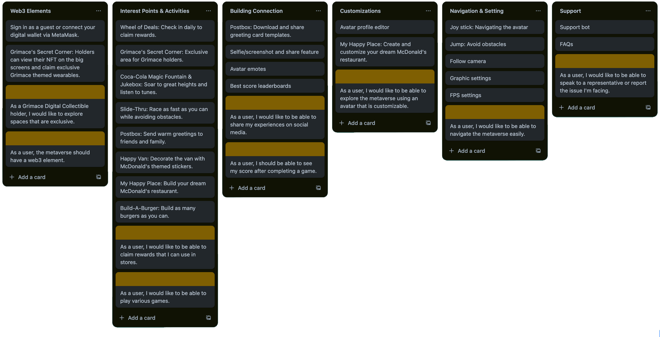
Based on the 'Must-Haves' and 'Should-Haves' user stories, I have translated them into detailed features and content for the app, outlining the user flow. Drawing inspiration from Spatial, I integrated essential features and content to enhance user experience and streamline the app functionality.
Design Principles &
Design System
Once the features were defined, the next step involved mapping out the app's visual presentation.
The primary aim was to ensure that the product was user-friendly and practical.
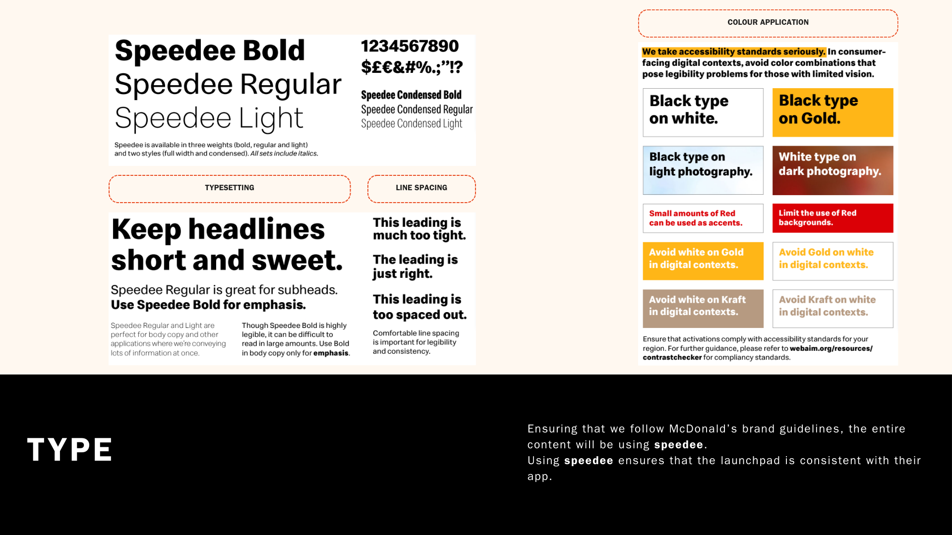
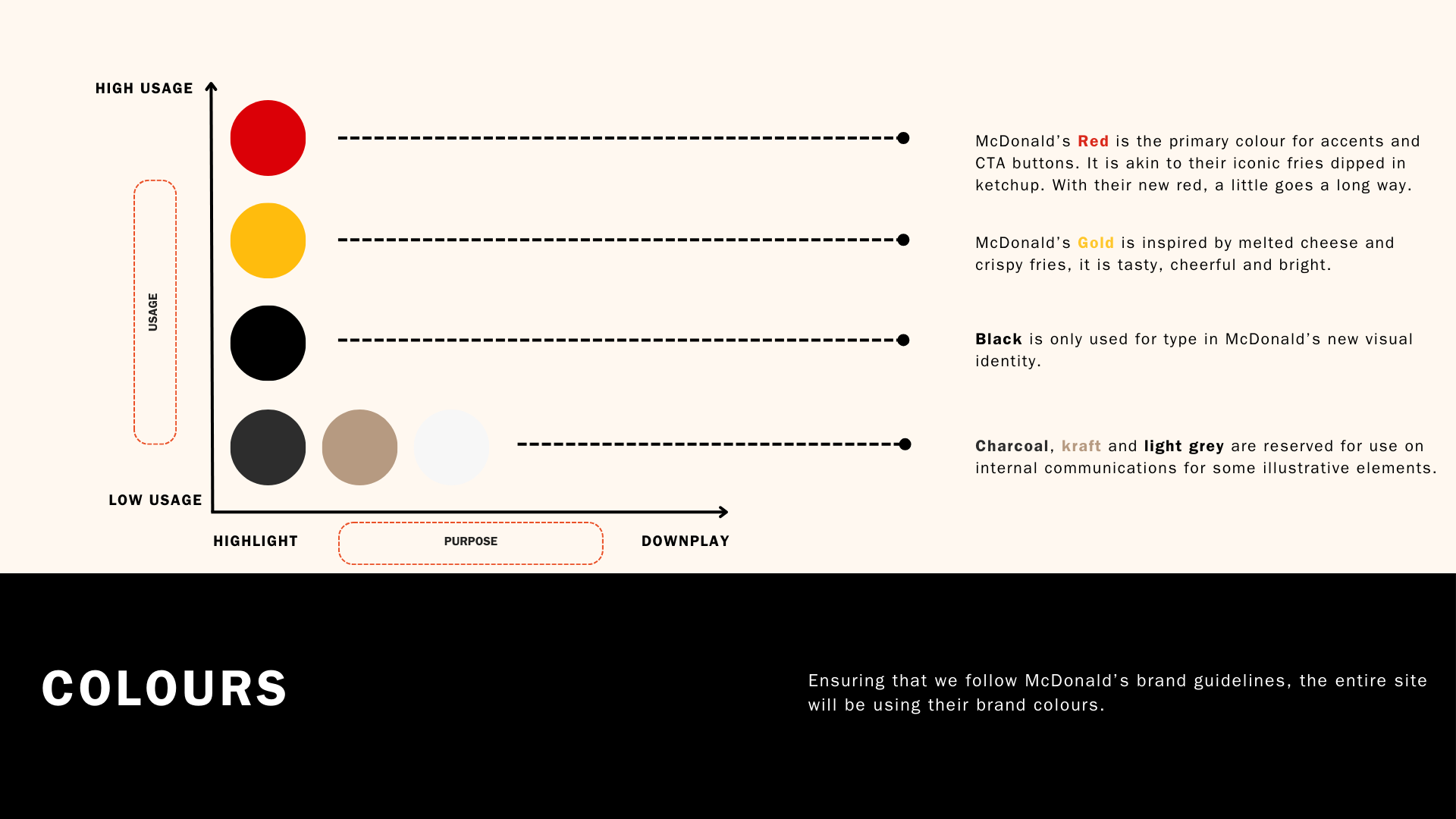
Drawing inspiration from McDonald’s clean design for its trusted and easy-to-navigate interface, the design also integrated playful elements to cultivate a welcoming and amicable look and feel.


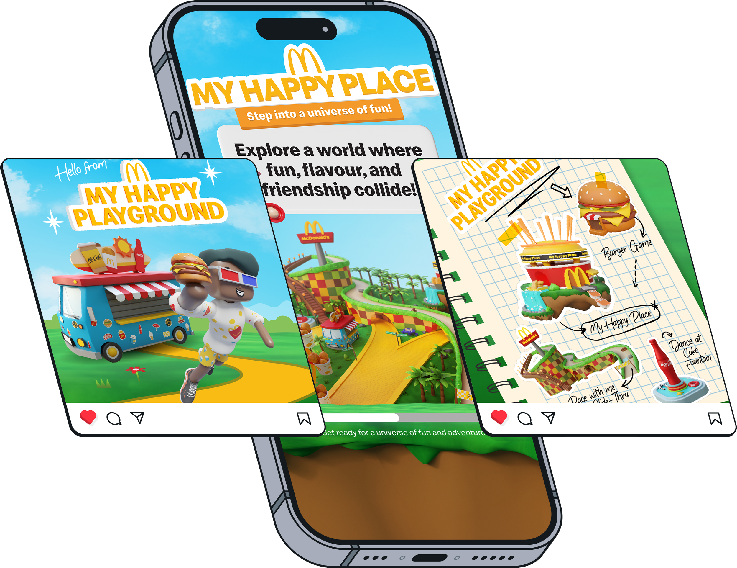
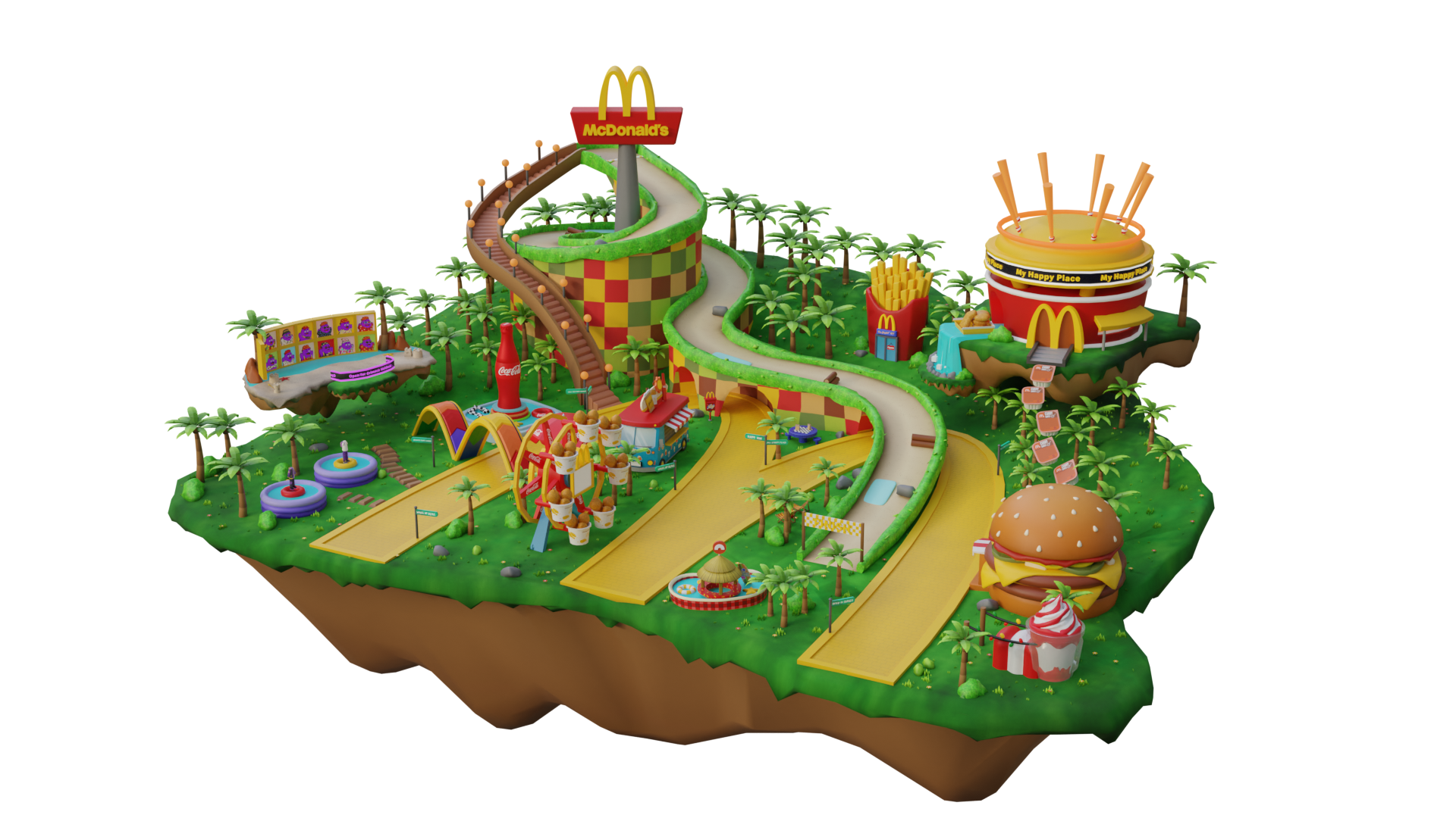
My Happy Place, a virtual destination that brings together the best features and iconic elements from McDonald’s, aiming to become everyone's favourite place.
Within My Happy Place, users can immerse themselves in a vibrant and dynamic environment, filled with a rich combination of elements and attractions. Whether it's stunning landscapes, awe-inspiring architecture, or exciting activities, My Happy Place offers a unique and personalized experience that resonates with each user's preferences and desires.
By curating an inclusive and captivating virtual sanctuary, our goal is to provide a space where users can find joy, inspiration, and a sense of belonging in the metaverse, truly making it their own Happy Place.

User App Experience
To ensure that users are actively engaged throughout the entire 4 weeks of the event, I developed the user flow of all the interest points in My Happy Place.
Utilizing my design systems, I developed high-fidelity designs in Figma. To quickly visualize and iterate the app's look and flow, I first sketched low-fidelity designs on paper. Please feel free to request these initial designs if needed.
-
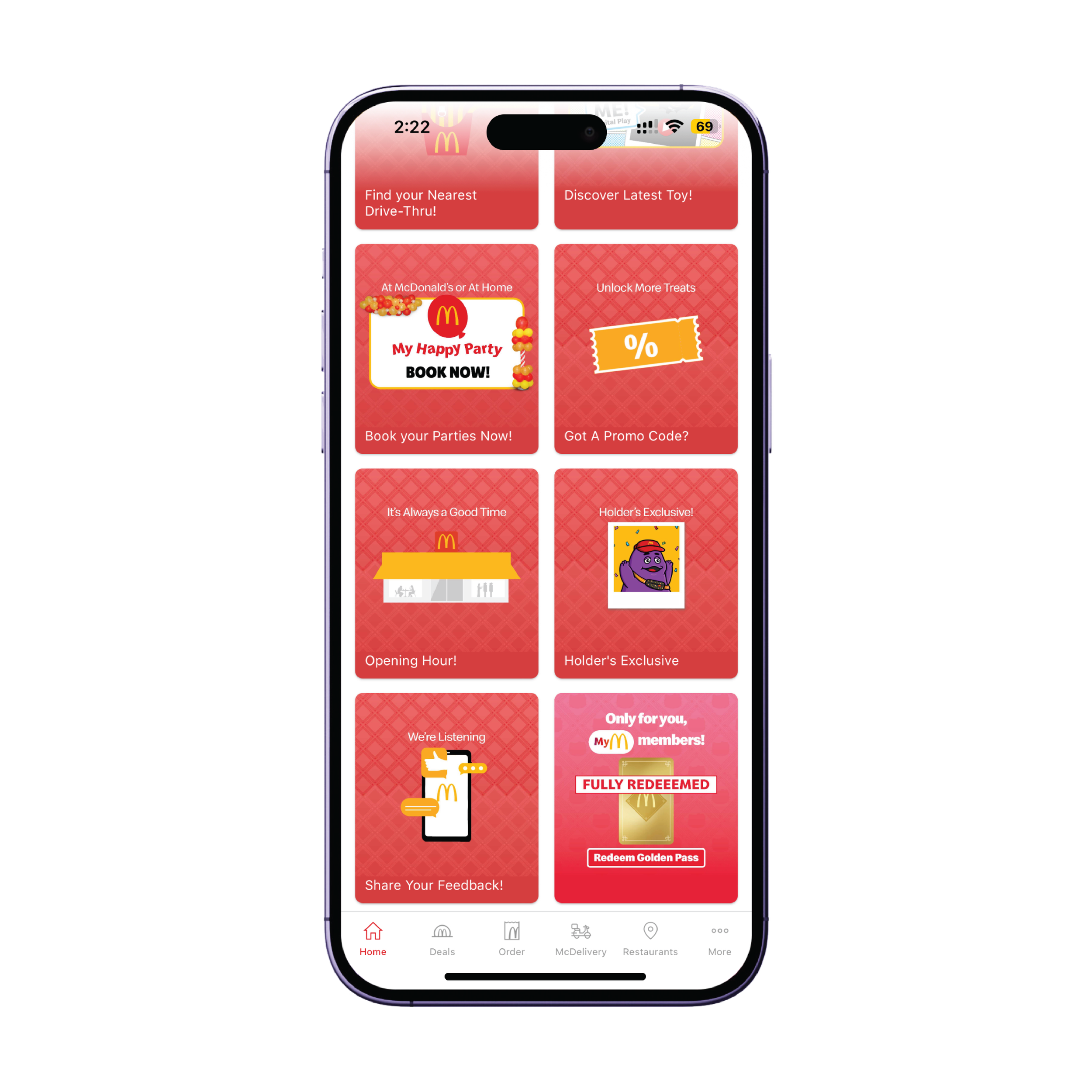
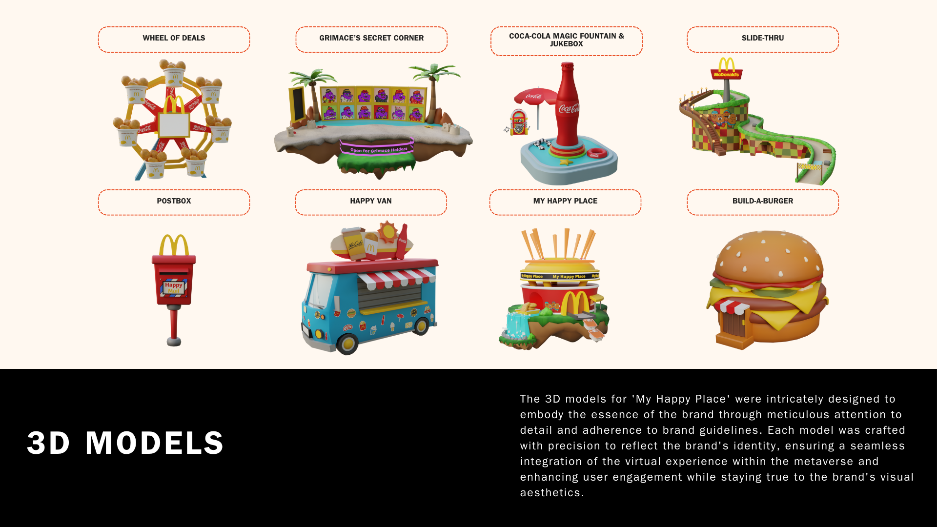
In the user journey, checking in at the Wheel of Deals and completing the daily task is crucial to unlocking rewards.
Daily deals are updated and refreshed every 24 hours to provide users with a fresh and engaging experience.
-
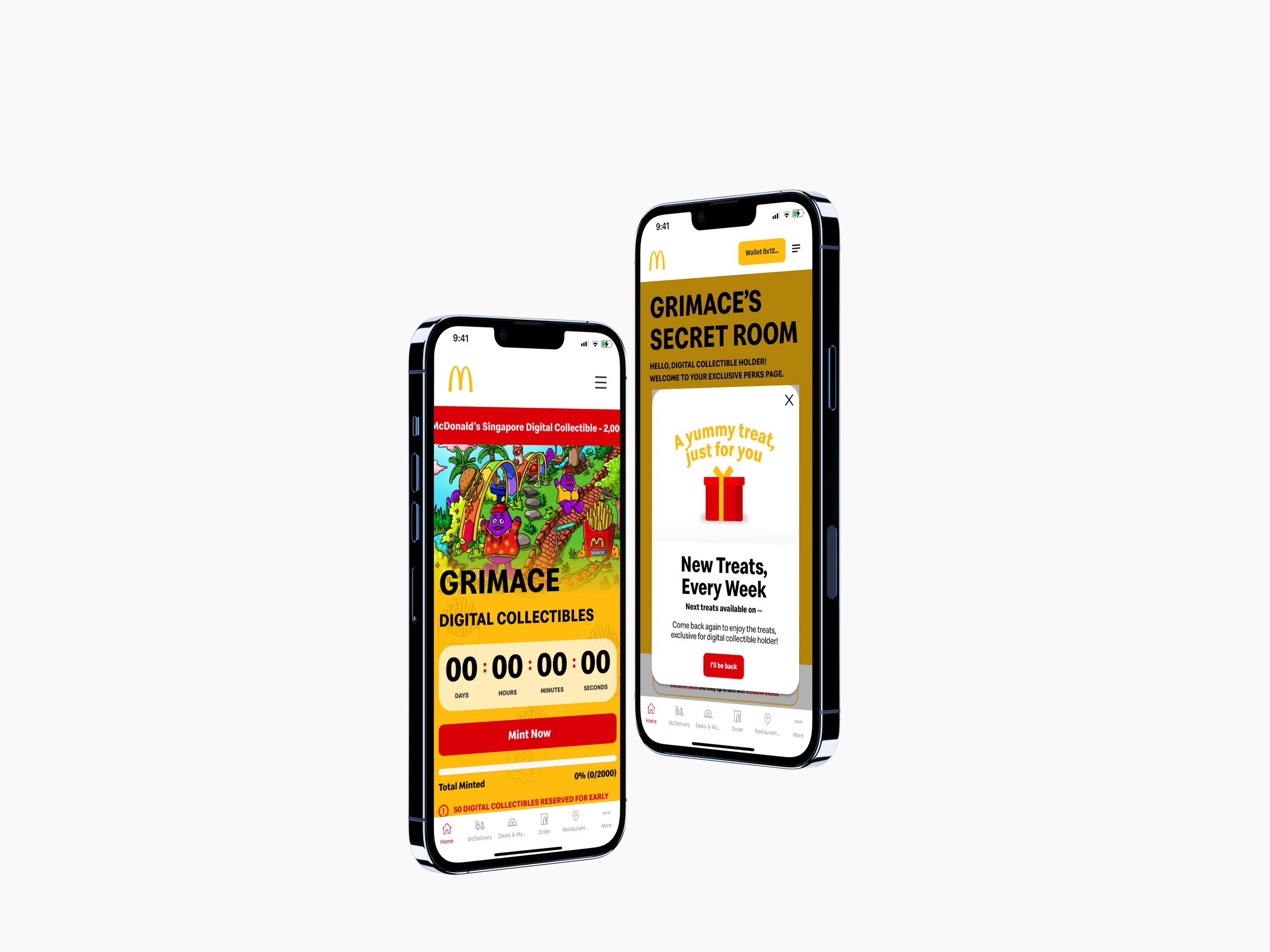
An exclusive area within the metaverse specifically for Grimace Digital Collectible holders to access premium features.
Grimace holders have the privilege to claim unique Grimace-themed digital wearables, allowing them to personalize and dress their avatars in an exclusive style.
Additionally, Grimace holders can visit the floating island, where they can admire and showcase their Grimace Digital Collectible on the big screens, elevating the sense of ownership and pride in their virtual possessions.
-
The Coca-Cola Magic Fountain offers users the ability to soar to great heights, offering a thrilling bird's-eye view of My Happy Place.
Additionally, users can immerse themselves in the musical atmosphere by visiting the Coca-Cola jukebox to enjoy a selection of tunes, further enhancing their overall experience within the virtual environment.
-
An exciting and challenging activity for users to participate in by racing down the slopes at the Slide-Thru.
While navigating the race-track and avoiding obstacles, users are encouraged to aim for their best time and reach the finish line as quickly as possible.
To incentivize and promote healthy competition, users' fastest scores are displayed on a leaderboard at the end of each race, motivating them to keep coming back for more adrenaline-fueled competition.
-
Users have the option to select, download, or share heartwarming greetings with their friends and family, fostering meaningful connections and spreading joy through our platform.
-
Users have the opportunity to choose from a diverse selection of 8 McDonald's themed stickers to adorn the Happy Van, allowing them to customize their vehicle with a new sticker each day.
-
Users can unleash their creativity by designing and building their very own dream McDonald's restaurant.
Within this creative space, users are granted the opportunity to decorate their restaurant using a variety of furniture and decor options, all while being limited to a maximum of 2 rooms.
To further enhance the user experience, we have incorporated a feature that allows users to explore and discover other uniquely designed spaces created by fellow users. With the ability to filter by the latest, most viewed, or even random designs, users can find endless inspiration and engage with a vibrant community of McDonald's enthusiasts.
-
Build-A-Burger is an exciting experience where users are challenged to construct as many Double Quarter Pounder with Cheese burgers as they can within a limited time frame.
Users will have 30 seconds to showcase their burger building skills, striving to make as many burgers as possible. But, here's the twist! If users can accurately build a burger within 3 seconds, they will earn a time booster as a reward. This time booster will extend the timer, allowing users to continue building and breaking their own records.
Prototype
Measurement
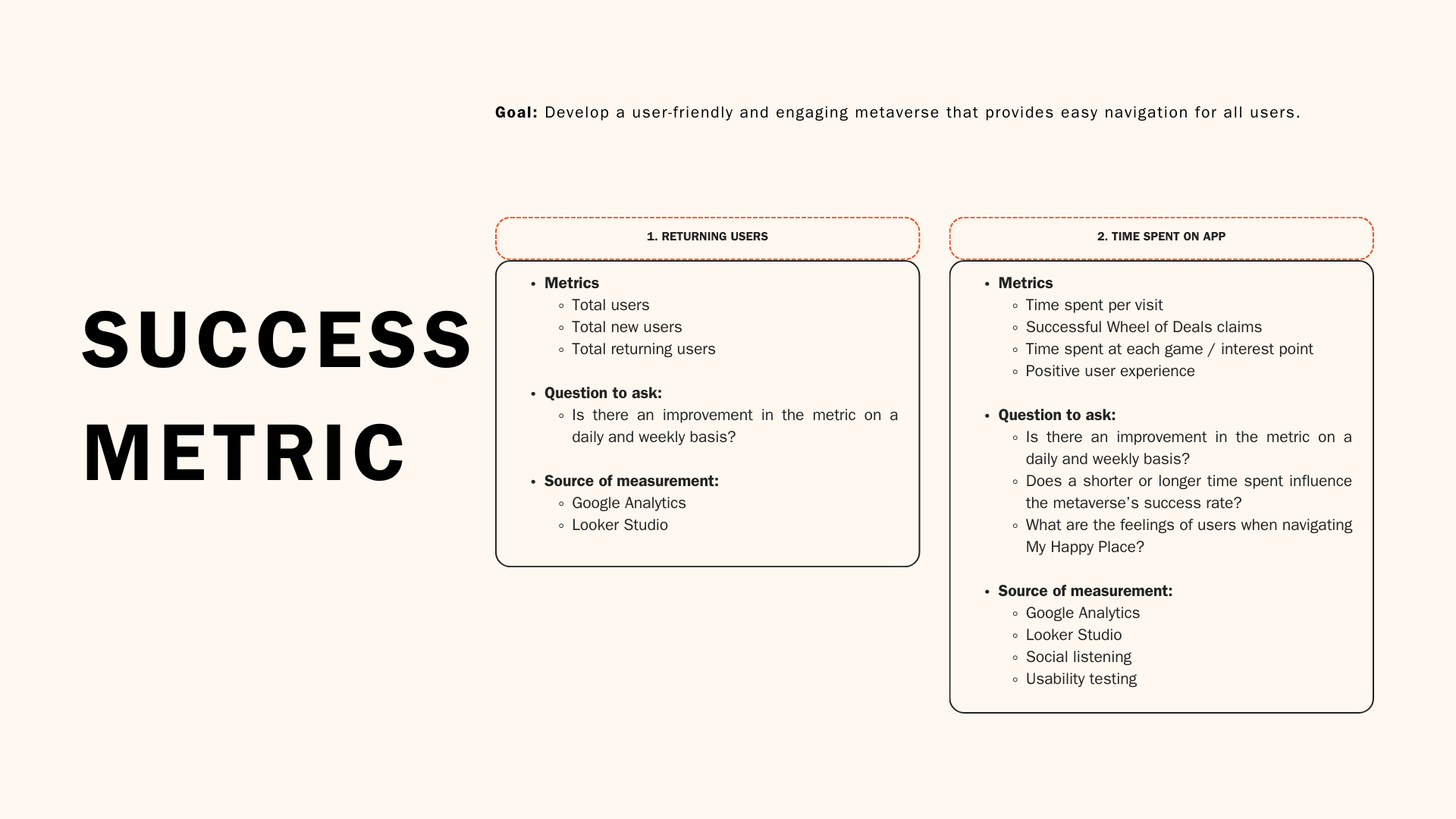
In the concluding phase of my project, I established criteria to gauge the extent to which the launch pad has effectively delivered a smooth user experience. The main measure of success is determined by the number of unique users, which exceeded 50k, with a target of 150k. Additionally, the average time spent playing games on the app was a notable 8 minutes, serving as a secondary metric of success.

Before launching My Happy Place, I carried out a usability test internally with McDonald’s Crews and superfans, to gather feedback on the prototype and pinpoint any noteworthy improvements.
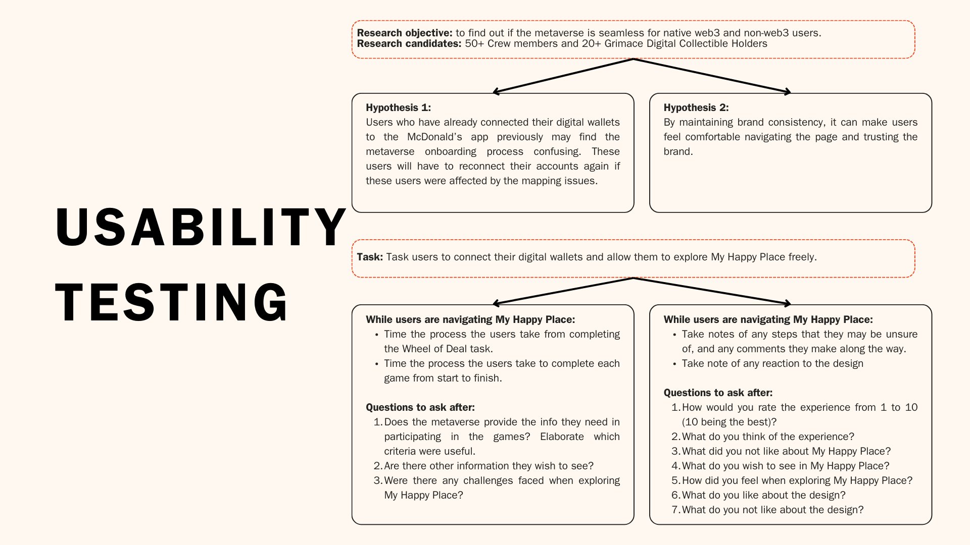
User App Experience
1. Time spent on the app:
Satisfactory
The data shows that users typically spent an average of 4-5 minutes in the metaverse engaging with the Wheel of Deals and completing tasks to unlock rewards. Interestingly, the point of interest where users spent the most time was within My Happy Place, with an average of 8 minutes spent in this area - this particular aspect of the metaverse allows users to create and customize their own virtual McDonald's restaurant. Understanding the user's attraction to this feature can help us improve the design and value proposition of the experience for future campaigns.
2. Information on the app:
Satisfactory
As a product designer, the provision of interactive tutorials and instructions within the metaverse played a crucial role in enhancing the user experience for newcomers entering My Happy Place for the first time. This feature effectively guided users through the virtual environment, helping them navigate and interact with the space seamlessly from the get-go.
3. App experience:
Easy to navigate
Users typically rated their experience as 7 out of 10. Although most did not give a perfect score, they considered the user experience to be simple and easy to navigate.
Although there was a helpful start-up guide that identified the key landmarks and activities in My Happy Place, some users expressed difficulty in discovering the interest points necessary to complete the Wheel of Deal tasks.
We also provided a dedicated support channel for users experiencing issues or having questions, ensuring their concerns are addressed promptly. The total number of tickets submitted remained under 100, demonstrating that this represents less than 0.01% of McDonald's app users.
4. Design:
Highly Satisfied
Users expressed great satisfaction with the design and layout of My Happy Place. They particularly valued the attention to detail, such as the inclusion of McNugget stickers on the landmarks, which not only enhanced the overall aesthetic but also effectively tied back to the ongoing month-long McNugget campaign.
Takeaways
My Happy Place successfully fulfilled its role by actively engaging its user base and seamlessly integrating the month-long McNugget campaign alongside the McNugget Digital Collectibles. This strategic approach not only increased foot traffic to their physical stores but also contributed to revenue generation. Each reward earned by users upon completing the Wheel of Deals required a minimum spend to redeem the discounted menu item, thereby incentivizing continued engagement and driving sales both in-app and in-store.
The shortcomings experienced during the metaverse launch meant that we needed to enhance the app's technical capabilities to ensure a smoother user experience. Through a process of refinement, this will aim to address any issues discovered during usability testing, taking into account user input as a priority to stay aligned with changing user requirements. The dedication to continuous improvement remains critical to BWLand's lasting success and maintaining user satisfaction in the long run.
Let’s Connect
amanda.tn@gmail.com
-
![]()
McNUGGET DIGITAL COLLECTIBLES
-
![]()
BWLAND
-
![]()
GRIMACE DIGITAL COLLECTIBLES